Case study
How a brutal ads market led Atmosphere TV to connect with an untapped audience to capture engagement and sweet, cold cash
Imagine you’re the CEO of a streaming-for-business TV company. You have devices across 60K businesses in the US. Your revenue comes from advertisers, but they’re suddenly spending (much) less. You have 130mm views a month but no direct relationship with viewers (the patrons of businesses who stream Atmosphere TV).
What do you do?
CompanyAtmosphere TVDuration12 monthsRoleSole design contributor for the work shown below - as the design and research lead
Market Size
Epic on scope, tiny on details
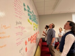
When it's up to a team to define requirements an scope, I like a workshop format.
Getting a cross-functional team in a room can be hugely productive – as long as there's the proper structure.
I led an Opportunity Solution Tree workshop, created by author Teresa Torres. The team collaborated to identify the TAM (total addressable market), align on key KPIs and to guide decision-making on the project.
Initial goals
The team, spurred on by optimism from the board and the company founders, had a broad vision for the impact of interactive entertainment.
Goal
Engagement
120k unique events / mo - events such as signing up, answering a question or participating in a survey
Goal
Venue growth
Propel venue growth from ~80k venues in 2024 to ~300k venues at the end of 2025
Goal
Revenue
Drive revenue growth, at least $100mm by the end of 2025 via monetization from Interactive Trivia
Wildy ambitious
The answer is yes, the goals were unreasonably big.
We based our initial KPI guidance on previous performance and the needs of the business.
VIsion
How we choose a game as the method for capturing attention
I exaggerate (but only in the name of entertainment).
Based on experiments with surveys and a photo-sharing experience that launched and never caught on, we decided a game was a relatively safe bet (as moonshots go).
A game like Trivia hit the sweet spot of 1) an existing sub-culture of trivia events across our venues 2) wide distribution of smart phones 3) the viral popularity of HQ Trivia in the early 2020s and 4) Atmosphere TVs in over 65,000 venues across the United States.
Above, the vision for Atmosphere TV’s interactive experiences.
Network effect
Would 85k screens drive adoption?
We sure hoped so.
Throughout our initial KPI planning, we assumed that Atmosphere's network would give adoption a strong tailwind.
But would Atmosphere viewers take (immediate) action after viewing an ad for a mobile Trivia game?
All in on QR codes
Throughout the 2000s and 2010s, QR codes languished in relative obscurity - despite the integration of a QR scanner into the iPhone in 2017.
People just didn't get how to use them.
The 2020 COVID pandemic introduced the broad public to QR codes for many uses, including QR-scannable menus, coupons and more. The 2020s thus paved the way for broad usage of QR-scanning by the general public.
Conversion rate test
QR menus are bad enough. But imagine, if you will, what it would take to get you to scan a QR code off of a TV screen 15' away.
When the Interact team was established, it was clear there'd be a single viable way to engage our viewership at scale: table tents.
Just kidding. The answer is QR codes.
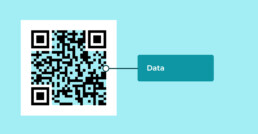
We created a test survey to determine a baseline QR code scan ratio - scans per 1,000 impressions.
To test this, we built a bare-bones survey in the form of an on-screen QR scan and played it across some key venues.
Initial test - high level of error correction
With high levels of error correction, QR engagement was .05 scans per 1,000 impressions. At a max of 10% of the fleet ever playing the Trivia channel, based on our experiment, it would yield 650 scans/month.
Improvement - larger size, less error correction
With increased real estate for the QR code, and less error correction (more scannable from a distance), scans improved from .05 scans per 1,000 impressions to ~.12 scans per 1,000 impressions, a 2.4x improvement.
QR Codes
QR codes were built for use in the physical world
Look, I get it. The history of QR codes is not the most interesting. But did you know that QR codes have been around since the 1990s?
Before the were in restaurants, QR codes powered the supply chain across the world as a three-dimensional barcode, of sorts.
The most important feature, for our purposes? Error correction.
Depending on how its encoded, QR data can be re-constructed even if part of the scannable area is damaged or otherwise unreadable.
The trade-off is that highly redundant codes are less scannable from a distance.
Examples of redundancy levels in QR codes (stay with me, I see you nodding off)
- Level L – 7% of data can be restored
- Level M – 15% of data can be restored
- Level Q – 25% of data can be restored
- Level H – 30% of data can be restored
Our initial assumption was that codes needed to have the highest level of redundancy.
Why?
Because players would be scanning TVs from a distance, with the potential for QR codes to be obscured by glare, dust, viewing angle or other obstructions.
Viewership in the millions, but scans in the hundreds. Call us stubborn, but we had the winds of the company leadership behind us. We forged ahead.
Our initial results weren't encouraging.
What we ended learning wasn't so much that no one would scan QR codes – in the end, they very much did.
We ended up learning that the incentive to scan mattered way more than we initially assumed. A survey vs. a game was a difference of about 10x more scans (can you guess which was which?)
Gameplay
In a meeting with the SVP of product, the director of engineering and myself, we decided to push forward with the project.
I took the next step of creating the flow of the game as an individual contributor.
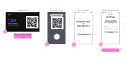
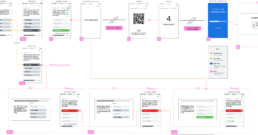
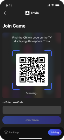
I worked with engineers and others on the design team to create a broad model of how the game would work from QR scan through repeated play, from TV to app store, to the mobile game.
High fidelity
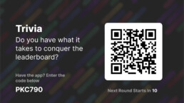
Our initial prototype for the TV
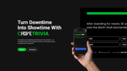
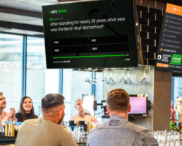
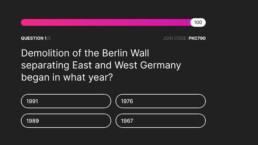
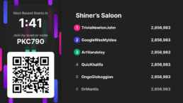
When patrons were at a venue (most likely a bar), with the Atmosphere Trivia channel playing on a screen, they'd be invited to play Trivia via QR scan to download a mobile application. The team balanced messaging clarity at ~10 feet, the size of the TV, and size of the QR code. This screen in particular evolved to be more attractive and enticing.
View from their phone
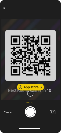
A successful scan via a phone's camera would bring up an affordance to go to the app store to download the Trivia game.
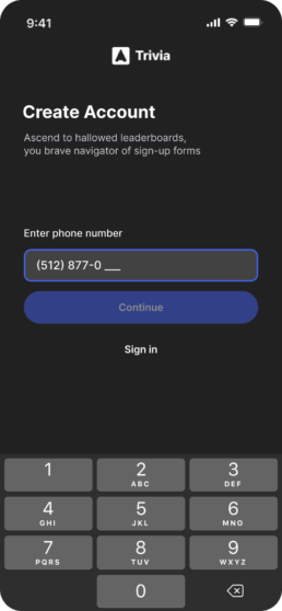
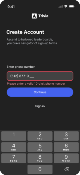
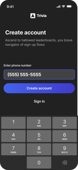
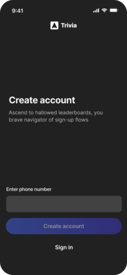
Opening the app would ask them for a phone number to create an account
We did away with splash screens as much as possible. We found that patrons at a bar were curious, but not so much so that they'd sit through long-loading splash screens. We wanted to get them into the game as quickly as possible.
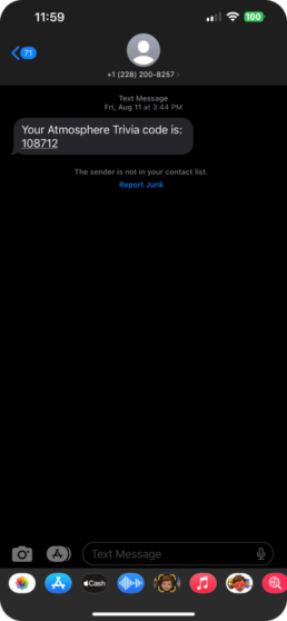
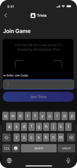
They'd quickly receive a code for Trivia
SMS deliverability proved to be a problem that the engineers grappled with. They'd be able to copy/paste the code to move forward with the sign up process.
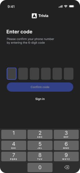
Code entry was quick
Wanted to make this as standard and familiar as possible
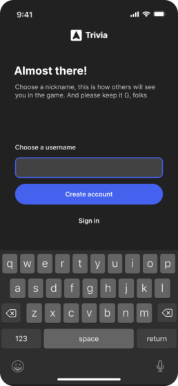
We used an Amazon product to check for profanity in usernames
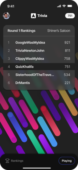
With many points of fall-off, user names proved to be another challenge. The concept of the Trivia game was that there'd be a leaderboard with user names on the venue TVs. We had to tread cautiously to make sure we balanced speed of sign up with error messaging around inappropriate user names
Success messaging
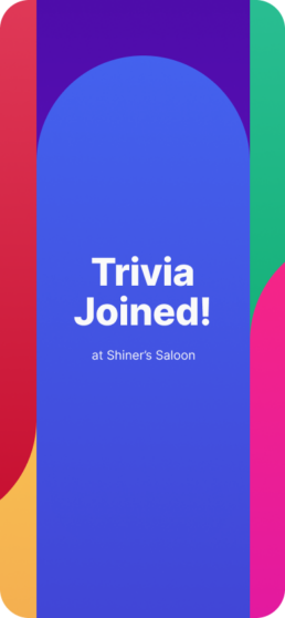
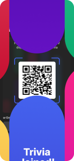
We used an animation and messaging to show users they were in - and if a game was underway, we put them right into the gameplay.
Error handling
Using error handling to influence sign up success
During design, I considered different initial button states. One was a 'teaching' interface with always-available buttons providing additional info on press. Instead, I chose a 'focus' interface, with buttons disabled until a valid phone number is entered. This worked well since the structure of phone numbers is highly familiar - on something like password selection, a 'teaching' interface would probably be better suited.
Teaching - 'Continue' always available
One option we explored was allowing players to click the 'continue' button anytime - clicked with incomplete data in the input, the player would get an error message with additional information. During prototyping, this option proved slower with unfamiliar users.
Focus - 'Continue' unavailable
We decided to go with a focus option - we removed the ability to click 'continue' until the field had the necessary 10 digits - the only requirement for the field. Our results (below) showed this to be an appropriate choice in this situation.
Conversion impact
The sign-up flow converted at 75% +
Once users scanned the QR code, we successfully converted them into players: 78% of users who scanned ended up playing Trivia on their phone, with a peak of nearly 90%. This unique user journey proved successful. The key decision that enabled this was pushing back against unnecessary sign-up fields.
Recommendation
Justin Martin • 1st
Jon is the rare kind of thinker who can identify the right problem. I had the pleasure of working with Jon on a greenfield project where, aside from a few base requirements, there was no bounding box on what we should build. This is where Jon excelled. A great mentor, leader, individual contributor, thinker, and communicator. If you are looking for an all-in-one Product Designer, Jon is the man for the job.
Playtesting
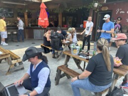
The hard, back-breaking work of play-testing a mobile Trivia game at a rooftop bar with a bunch of enthusiastic new media folks
Look, somebody has to get their hands dirty.
And if that means braving the beery environs of a downtown Austin bar, I'm there for it.
Sure, employees were wildly biased in favor of the game. But if I remember my college philosophy 101 (proud owner of a B+ in that one), objectivity is myth – or so we told ourselves.
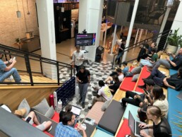
Indeed, we discovered a multitude of issues that we hadn't seen in previous intra-team testing.
We discovered an under-appreciated aspect of user and gaming experience - time
To our surprise, the biggest insight we took away from all the testing was in the realm of timing. Even at our first test in the Atmosphere atrium, it was clear that we had an issue of timing - the game's 10 questions felt far too slow. Iterating on the timing over the next few play tests helped us arrive at the game play that would be featured in our initial launch.
Faster gameplay led to an objectively better, more social gameplay experience.
NPS improved for shorter question times
Perceived socialization improved with shorter question times
The game
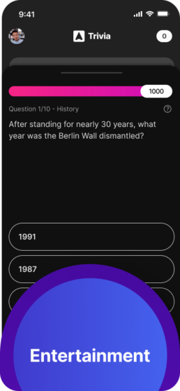
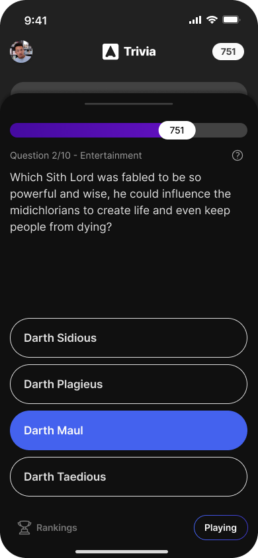
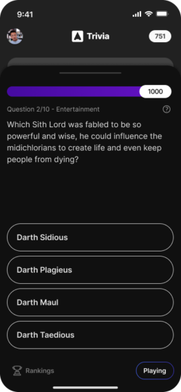
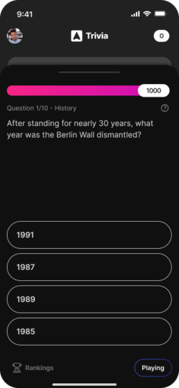
In a six-month timeframe, the team brought Interactive Trivia to life across Android mobile, AndroidTV, iOS and AppleTV - four platforms.
Here's where we stood on user engagement: On average, each player participated in 1.4 trivia games during a single session, tackling approximately 17 questions. Most users dedicated a solid 10 minutes to the experience, truly immersing themselves in the fun. Even more impressive, 30% of users kept coming back for more even after five weeks had passed.
Project outcomes
We did better than we imagined
Despite early setbacks, persistence paid off. After refining both the QR code experience and the game flow, our scan rates improved 2.4x, and the conversion rate from scan to game hit an impressive 78%. But the real success? Players were returning week after week to play again. We went from an interesting idea to a full-fledged engagement tool, with users not just participating but becoming part of a larger trivia community.
The project delivered much of what we set out to achieve—a seamless, scalable way to engage viewers across multiple venues. It also provided Atmosphere with a new format for ad revenue, where trivia sponsors could take center stage in a fun, interactive way.
Success
Engagement
With 30,000 downloads/mo of Trivia, a 70% conversion rate and an average of 17 questions answered per player, we had ~350,000 engagements/mo a few months post-launch, doubling our initial KPI
In progress
Venue growth
Post-launch, we saw growth in additional screens for existing venues, from 85k to 90k. While impressive, compared to our 2025 KPI this was modest growth that we'd need to improve via marketing and Atmosphere viewers making requests to venue owners.
In progress
Revenue
While revenue was initially imagined coming from players, it was clear that the easiest path to monetization would be advertiser sponsorship of the game itself.
What made this project a true success was the relentless focus on iteration and collaboration. Working closely with developers, we bridged the gap between design and engineering, ensuring that every component worked smoothly on both mobile devices and TV screens. Through constant feedback loops and user testing, we refined the product to be both engaging and user-friendly.
In the end, the Interactive Trivia project wasn’t just about building a game. It was about creating an experience—one that turned passive TV viewers into active participants. This wasn’t just a solution to a softening ad market; it became a cornerstone of Atmosphere’s strategy to engage users in new and exciting ways


