Case study
Chaos to clarity: building a design system that stuck
“What do you think of design systems?”
When an engineering leader asks a question like this in an interview, you know there’s 1) a right answer and 2) a backstory.
Atmosphere’s design system (as I found out) slowed down development and created inconsistencies across products.
Designers were struggling to maintain cohesion, and developers faced unnecessary hurdles, building elements from scratch.
CompanyAtmosphereDuration6 monthsRolePrimary design, project lead
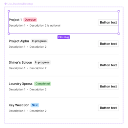
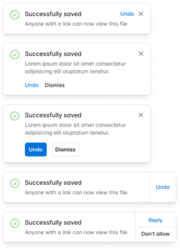
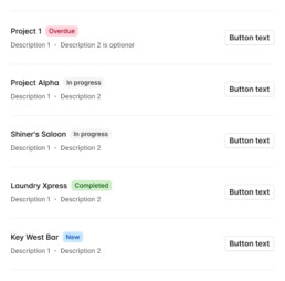
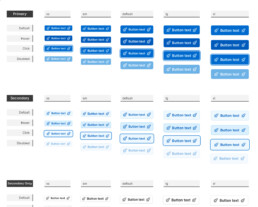
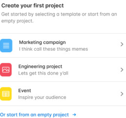
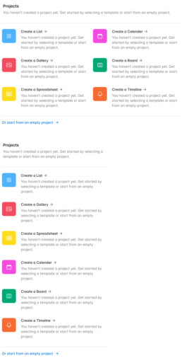
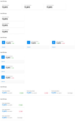
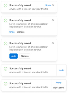
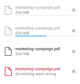
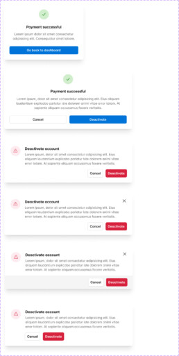
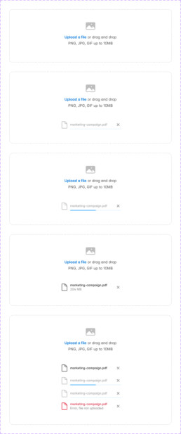
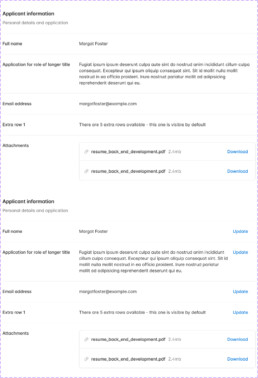
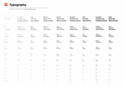
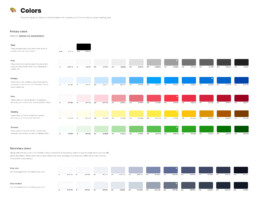
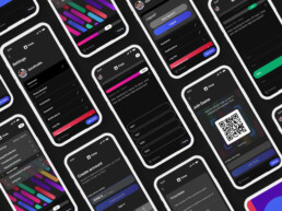
Some of the final assets for the design system
Goals
Based on conversations with folks connected to the project, my pitch was simple; 1) refactor the Figma style guide to help wrangle complexity 2) show credibility by moving fast and 3) show cultural alignment by not being too precious with the design system.
Goal
Adoption
One major goal was creating consistency by getting the design system adopted by the design team and the engineering organization
Goal
Scalable
The design system had to solve immediate issues, but also had to create a foundation that could support and encompass most of the UI and design patterns in the end product
Goal
Move fast
In order to get momentum (and resourcing) on a stalled project, we needed to move fast to prove a realistic, workable model
Tech debt
Nuke it
At heart, I'm an incrementalist. I believe strongly in the wisdom of previous teams. Starting from scratch usually isn't where I start - but in this case, it was a necessity. The previous team had used an off-the-shelf design system with 1000s of components and little in the way of standardized patterns. We decided to scrap this approach and start fresh.
Starting over
Design systems are often built in a vertical fashion, with the fundamental elements at forming a foundation of later work. This works because it allows teams to move elements into development with more speed.
Success depended on speed
I directed the lead designer on the design system, Admir, to refactor the existing Figma style guide, stripping away unnecessary complexity and creating a system that the design team could easily adopt.
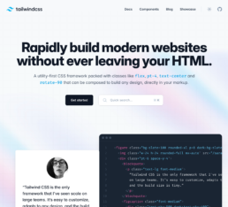
The next move was to align with the engineering team. After consulting with the lead engineers, we decided on Tailwind UI as our design system foundation.
The team organized elements within Figma, laying out type stacks along visual grids, organizing the hierarchy of the nested element structure and creating Figma text styles that would be accessible and scalable.
Get commit -m
The next move was to align with the engineering team and get a firm commitment on the approach to technology. After consulting with the lead engineers, we decided on Tailwind UI as our design system foundation.
To test the waters, we conducted a small-scale experiment within Atmosphere's oZone library, focusing on adapting the system to Tailwind’s framework. Typography, buttons, and colors were the initial building blocks, and we moved swiftly, implementing these changes within Figma.
Connecting design & eng
The team of five: designers and engineers
Key to the project’s success was ensuring a tight connection between design and engineering. We agreed on common variables, testing components like buttons in a development instance of oZone. Every decision we made was designed to solve an immediate problem, from atomic design principles for long-term scalability to the integration of accessibility as a default part of the process.
Mirroring variables
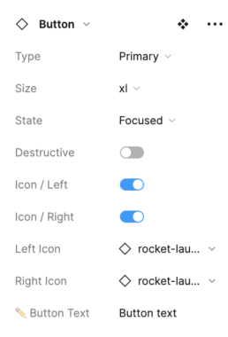
The designers wanted Figma to match the coded design system as closely as was possible within Figma's limits. We collaborated with the engineers to align Figma with matching variables inside the team's TailwindUI implementation.
Standardized naming conventions
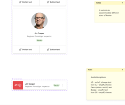
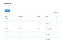
An example of oZone button naming conventions - we made sure that Figma and oZone were aligned, down to the names.
Storybook: creating a shared space
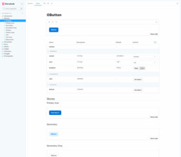
We used Storybook as the shared playground for Atmosphere's component library. This space served as a consistent place of reference, allowing designers and engineers to do Q&A and view upcoming releases of new components.
Recommendation
Tyler Pugh • 1st
We teamed up to create a design system in Figma using the Tailwind library at Atmosphere. This wasn’t the first time that Atmosphere had attempted to create a design system, but this was the first one to stick thanks to Jon’s tenacity and drive.
Engineering accessibility
I encouraged the team to be thorough and systematic about accessibility
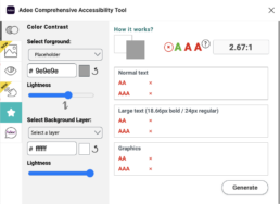
Accessibility was non-negotiable. I led the effort to make accessibility checks a routine part of the design system workflow, integrating tools like Adee into Figma to ensure compliance with standards like WCAG. This wasn't just about ticking boxes—it was about making products usable for everyone, effortlessly.
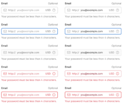
WCAG Normal Text AA - Fail
The initial design failed to meet WCAG - AA, a contrast ratio of 4.5:1 for normal text (smaller than 14px)
WCAG Normal Text AA - Pass
A slight adjustment resulted in a passing contrast ratio - notice the slightly darker red in the body of the message , the 'Your password' ipsum
I led the effort to make accessibility the default
One-and-done efforts don't achieve products that work for everyone. Accessibility has to be built into the process. The design team used a Figma plugin called Adee Comprehensive Accessibility Tool that makes it easy to do fast accessibility checking. Creating systems and processes made accessibility the 'default' as opposed to the exception.
Result: A Design System That Stuck
In the end, our efforts paid off. We created a shared design language that was adopted across both design and engineering teams. The use of Tailwind UI helped us build a scalable, flexible component library that engineers could implement with minimal friction. Although we faced some setbacks, like the inability to secure a dedicated design technologist early on, the overall project was a success.
Success
Adoption
The shared library and design language was adopted by design and engineering - and created consistency in the end product by being the operational default
Success
Scalable
Using Tailwind created a performant component library with the lowest possible switching costs
Miss
Move fast
We weren't able to secure initial resourcing (a design technologist) who could have helped accelerate the move from Figma into oZone (and into the product)
We set a foundation that not only solved immediate issues but provided a roadmap for future growth. This wasn’t just a design system—it was a system that stuck, empowering both designers and developers to work more efficiently and effectively.
