Led design of mobile trivia game for an audience in the millions and a unique path into gameplay
Atmosphere wanted to leverage its monthly viewership of 130mm/mo by building an interactive game on iOS and AppleTV devices.
Project outcomes
The leaders envisioned a global game on four platforms, aiming for traction through group play at venues. The KPIs targeted five venues, each with five players. The concept relied on local communities, expecting player numbers (5-10 per game) to show the game's investment potential.
10mm
Total audience for Trivia
80%
QR Scan-to-play conversion rate
20+
Size of largest in-person games
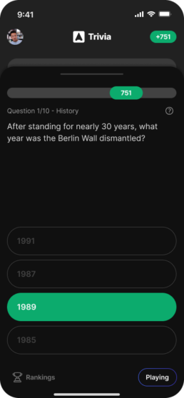
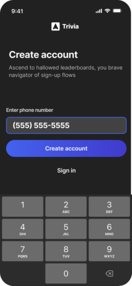
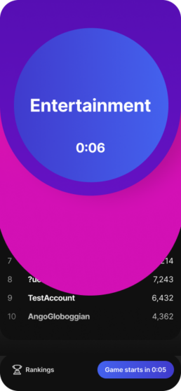
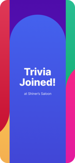
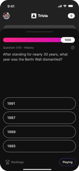
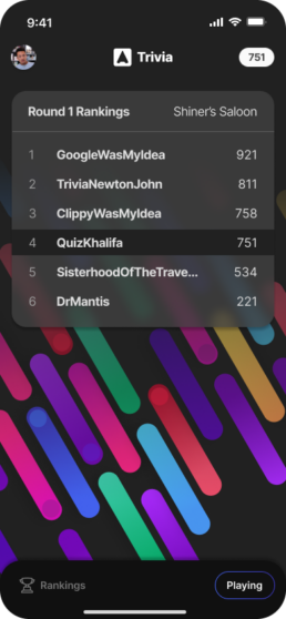
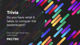
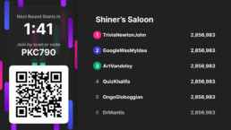
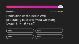
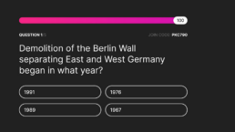
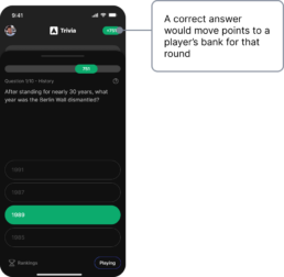
Screen design for the game in iOS and AppleTV form factors
Sizzle reel made at the time of initial play testing to demonstrate a holistic vision of the gameplay experience
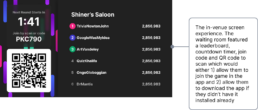
An interactive game would connect Atmosphere directly to tens of millions of viewers in pubs, restaurants, bars and airports
Atmosphere is streaming TV for business — Netflix for business, you might call it. A device sits behind a business's TVs, with 40+ channels of linear and video-on-demand short-form, audio-optional content. While Atmosphere was ad-supported, they felt that they could open up a new market by creating an interactive game for Atmosphere's viewership.
65,000 venues
Atmosphere is in 10s of thousands of businesses across the US, offering over 40 channels of engaging, family-friendly entertainment
130 million views / month
Atmosphere reaches millions of viewers per month in restaurants, bars, airports, and quick-service brands like Burger King, McDonald's, and many others.
Goals
The leaders envisioned a global game on four platforms, aiming for traction through group play at venues. The KPIs targeted five venues, each with five players. The concept relied on local communities, expecting player numbers (5-10 per game) to show the game's investment potential.
Goal
Global sync across four platforms
The core of the game needed to work in sync worldwide on iOS, AppleTV, Android and AndroidTV platforms
Goal
Efficient path to gameplay
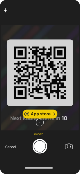
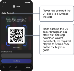
Initial experiments showed a low willingness to scan QR codes. We needed maximize the number of viewer who made it to the game, with a KPI of 60% sign up conversion and at least 2x initial QR scan rates
Goal
Group play drives adoption
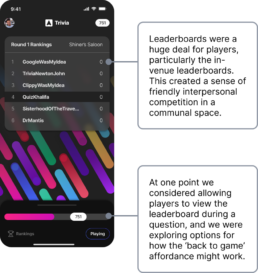
We hypothesized that an in-person, communal experience would create word-of-mouth momentum to fuel adoption. An initial KPI of seeing 5 venues with 5+ simultaneous players would provide data to test this theory.
Mitigating risk
Does anyone scan QR codes? I led the team to find out
When the Interact team was established, they explored engagement options like Trivia. I held meetings with the lead product manager to discuss testing the willingness of viewers to scan QR codes. This resulted in the team creating a test to determine a baseline QR code scan ratio - scans per 1,000 impressions. With a baseline established, they moved on to improve scanning rates significantly.
To test this, we built a bare-bones survey in the form of an on-screen QR scan and played it across some key venues.
Initial test
Initially, QR engagement was .05 scans per 1,000 impressions. At a max of 10% of the fleet ever playing the Trivia channel, based on our experiment, it would yield 650 scans/month.
Improvement
The team increased the QR size, encoded less information and balanced the error correction level to our goals - resulting in codes that could be scanned from further away. The team took scans from .05 scans per 1,000 impressions to ~.12 scans per 1,000 impressions, a 2.4x improvement.
Justin Martin • 1st
One of the most difficult, and often neglected, challenges in creating an effective and lovable product is truly defining the problem to be solved rather than just searching for the perfect solution. Jon is the rare kind of thinker who can identify the right problem. I had the pleasure of working with Jon on a greenfield project where, aside from a few base requirements, there was no bounding box on what we should build. This is where Jon excelled. Asking the right questions, talking to would-be users, researching, defining the problem space, and methodically mapping out a path to building a great product. On top of his exceptional ability to uncover the problem a product is trying to solve, Jon was also an excellent designer. He ideated and created well considered UX scaffolding, high fidelity visual designs, video assets, animations, and everything in between. A great mentor, leader, individual contributor, thinker, and communicator. If you are looking for an all-in-one Product Designer, Jon is the man for the job.
We're moving forward
We started game development. With our early QR-scan-to-survey tests showing improvements to our initial KPI, we moved on to solidify the path into the game. This was the one time during design of the game that I worked as the lone contributing designer.
Optimizing QR scans with a high converting sign up flow
With a commitment to build and the game and improvements to the QR scanning rate, we tackled the next KPI - meeting the conversion rate goal for the account creation flow.
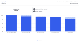
The sign-up flow converted at 75% +
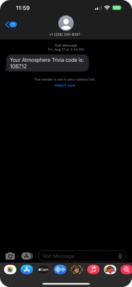
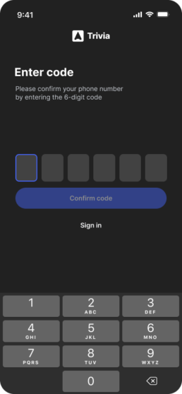
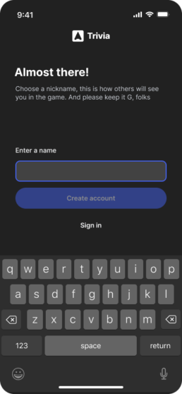
Once users scanned the QR code, we successfully converted them into players: 78% of users who scanned ended up playing Trivia on their phone, with a peak of nearly 90%. This unique user journey proved successful. The key decision that enabled this was pushing back against unnecessary sign-up fields.
How error handling influenced player success during sign up
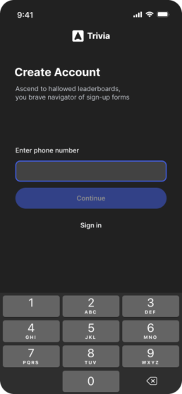
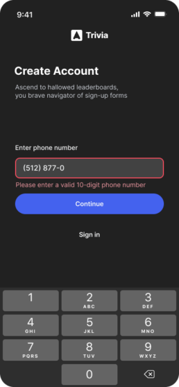
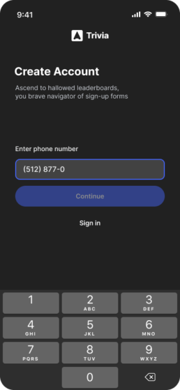
During design, I considered different initial button states. One was a 'teaching' interface with always-available buttons providing additional info on press. Instead, I chose a 'focus' interface, with buttons disabled until a valid phone number is entered. This worked well since the structure of phone numbers is highly familiar - on something like password selection, a 'teaching' interface would probably be better suited.
Teaching
One option we explored was allowing players to click a button anytime - clicked with incomplete data in the input, the player would get an error message with additional information
Focus
We decided to go with a focus option - we removed the ability to click until the field had 10 digits - the only requirement for the field. Our results showed this to be an appropriate choice in this situation
Designing a real-time, cross-device game
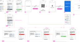
Screen flowcharts helped answer two key questions. First, what would the app look like and how would players navigate? Second, what was the relationship between the TV player and the mobile app? Each device needed to operate independently, while also pair together for a single, engaging experience.
Given the multi-device sync required, flowcharts were a necessary part of the requirements building, and helped the engineers and product managers envision how the TV and mobile app would interact. I created these during the sign-up flow work, and we used them throughout the development of the game.
The gameplay reward loop
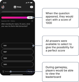
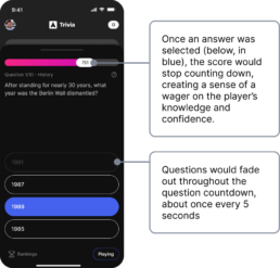
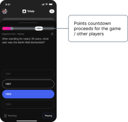
Successful game mechanics employ novel visuals alongside cycles of build-up, pay-off and release. We used prototypes to get a gut-feeling on the efficacy of each mechanic. Fast iterations helped us progress quickly towards a stable core of the game.
Core of the game
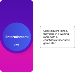
Once through download and sign-up, the game had a simple loop.
Pre-launch experience prototype
The true product isn't screenshots or interactions - it's the player experience while out and about. Here's a peek into how we saw that experience right before launch
A combined design effort got the game style production-ready
The visual style initially progressed slowly but gained momentum once I secured design resources from the visual communication design team at Atmosphere. This team, primarily focused on the content side of the business, operated separately from the product team. After discussing with the VP of Visual Design, I was able to allocate one of his highly talented team members, Chase, to the project. Together, Chase and I expanded on the early work I had done on the game play and UX. Our open collaboration proved to be a recipe for success in enhancing the game's visuals.
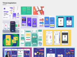
Games of this nature tended to be bold, colorful and full of personality. We tried to meld this with Atmosphere’s bold, tech-forward brand.
What I learned
Leadership and contribution aren't mutually exclusive
I enjoy putting the spotlight on the work of others. When seeking collaborations, this is a particularly valuable skillset. Who doesn't enjoy being recognized for the results of their dedication and skill? It makes collaborations seamless and in my experience, creates excellent outcomes.
Playtesting led to mission-critical changes to gameplay
Playtesting proved critical for smoothing the rough edges of the initial game, ultimately having a huge impact on the time element of the game and time between games.
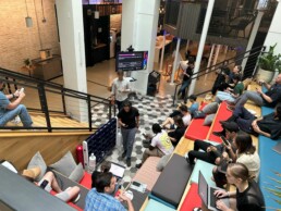
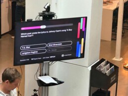
Interactive Trivia's first group play test
Photos from initial playtesting in Atmosphere's atrium. The team put this event together as a first real-world test, and to gather initial feedback about gameplay and timing.
What did we learn and how did that improve the game?
Playtesting lasted about 6 weeks - in that time we had groups of employees play the game, and we gave a survey after each round. We performed experiments, mostly on the time between questions and how long the countdown timer ran. We found excellent results with faster countdown speeds and longer spaces between games.
Results: reducing each question's countdown timer from 25 seconds to 12 seconds
NPS
Socialization with others during the game
Exceeding expectations: launch
In a six-month timeframe, the team brought Interactive Trivia to life across Android mobile, AndroidTV, iOS and AppleTV - four platforms.
Here's where we stood on user engagement: On average, each player participated in 1.4 trivia games during a single session, tackling approximately 17 questions. Most users dedicated a solid 10 minutes to the experience, truly immersing themselves in the fun. Even more impressive, 30% of users kept coming back for more even after five weeks had passed.
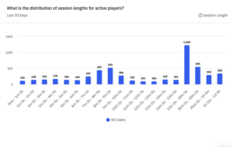
Interactive Trivia reached a core of early adopters, some playing for over 60 min/session
Session length on the mobile app told us a lot about engagement. Some of our largest cohorts were players who were playing for 15 min to 1+ hours. Even though adoption plateaued after launch, we felt encouraged that we had some early adopters bought in for 2-4 games.
With average playtime at 1.5 games/session, there was ample opportunity to further engage players
Number of questions answered told us a lot about the engagement of players. With 10 questions per game, 17 questions answered on average told us they probably made it to the 2nd game (there were 4 games an hour) before dropping off. To improve this metric I believe Atmosphere would need to invest in the core player experience.
Project outcomes
This was a sprawling project and I'm proud of what we were able to accomplish. Particularly from an engineering standpoint, the lift of building on four platforms was a huge effort. My leadership made a difference at the beginning of the project, persuading the team to think through key risks - and my contribution as a designer made a huge impact in the sign-up flow. I was able to get buy-in from the creative team to co-design the visual style of the game, a huge win for the launch and overall branding.
Success
Globally synced play
The game launched with synchronization across the world on AppleTV and iOS, followed by Android and AndroidTV soon after
Success
Efficient path to gameplay
In the end, Trivia surpassed our initial QR code experiments by 10x, peaking at 30,000+ scans/mo. We also created a sign-up flow with 75%+ conversion rate - this all helped maximize the impact of the invitations to play Trivia.
Success
Community powers growth
We met and exceeded the KPI and achieved large clusters of players in a single venue for the same game. We had at least 10 venues with 10+ players, which was a validation of the communal, in-person vision for the game.
With persistence, drive and ownership we were able to launch the game and make some big impacts on KPIs especially where it mattered – the path into the game, core gameplay, and communal play.
