Case study
Field Management app improved case resolution time by 39%
TurnKey managed thousands of vacation rental properties in 50+ markets around the US. In doing research on client sentiment, it came to light that clients were frustrated that 1) they couldn’t easily assign maintenance tasks to our team and 2) that they had no visibility into pending cases.
CompanyTurnKey Vacation RentalsDuration12 weeksRoleLead (only) contributing designer: research, interviews, wireframes, high-fidelity mock-ups, design quality assurance
Project goals
Often projects have an opportunity to be a win for the clients and a win for the business - this was one of those. Autonomy is one of those key drivers of happiness - if we could create more autonomous clients, not only would they be happier but their autonomy would come with the benefit of reducing operational burden on TurnKey support.
Goal
Efficiency gains
Originally the KPI was related to the number of inbound phone calls to support - we ultimately decided that case resolution time inside the app was a better measure of effectiveness, aiming for a 10% lift
Goal
Improved CSAT
TurnKey clients were frustrated on a lack of visibility into work going on at their vacation rental, and their inability to create a case on their own. We hoped to get a 5% lift on NPS for cases created inside the new system.
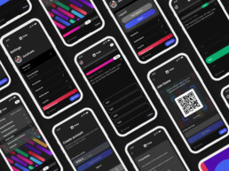
Rendering of the final UI in the various React form factors
Researching user needs
To start, I conducted phone interviews with TurnKey clients and operational staff
Two sets of users emerged from interviews
TurnKey clients described a need to reduce ambiguity about events happening at their property; and a need for autonomy, so they could request work without needing to call and speak to their support representative.
Clients
I want visibility and ease
I own a vacation home which TurnKey manages. To request work means a phone call to TurnKey client support. I'd also like to easily know when work is scheduled to start on issues, and what the status is.
Staff
Help me be efficient
I'd love an easy way (not Salesforce, please) to view my tasks, communicate with clients, take pictures and know that information is automatically being passed to clients
TurnKey’s field operations team could use the app as a task management system and use it as a way to communicate asynchronously with customers.
Stakeholders at TurnKey saw an opportunity to become more efficient, to allow a smaller cadre of support agents to represent a larger number of clients.
To buy or build?
TurnKey used Salesforce as a CRM, and the company looked into developing with Salesforce Lightning. The problem was the cost of seats was prohibitive, given the sheer number of field operations staff who would be using the system. Zendesk was an option we explored, but ultimately the needs of the team were so specific that no existing tool would yield significant improvements to the current process. These apps were excellent inspiration.
Jobs to be done
A jobs-to-be-done framework helped organize and operationalize what we'd learned in research
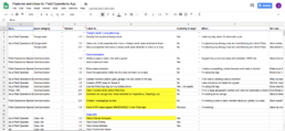
Interview notes turned into a jobs-to-be-done spreadsheet. Shown above, organizing the needs of so-called 'backstage' actors (the field operations staff) who actually do the maintenance on the home.
Narrowing our focus
To move the needle on client satisfaction, we decided to focus on client needs first
Clients
I want visibility and ease
I own a vacation home which TurnKey manages. To request work means a phone call to TurnKey client support. I'd also like to easily know when work is scheduled to start on issues, and what the status is.
Staff
Help me be efficient
I'd love an easy way (not Salesforce, please) to view my tasks, communicate with clients, take pictures and know that information is automatically being passed to clients
Early prototypes
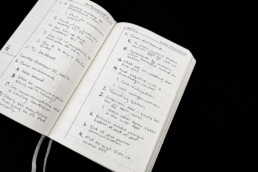
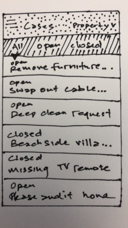
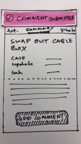
Hand-drawn sketches - a fast communication to stakeholders about direction
I used hand-drawn sketches to communicate the direction we (the product manager and myself) were thinking about taking the product. At that time, I used Marvel to create a clickable prototype to demonstrate interactivity and flow.
Drawings communicate the early, fungible nature of the design thinking
All you need is a ballpoint pen, paper, scissors and a highlighter to bring products to life - even if it's slightly slower, the benefit of communicating an early iteration is invaluable.
We took the hand-drawn prototypes to potential users for informal conversations about the direction of the product
Some customers enjoy being ‘in the work.’ We had a few potential users passionate about managing their rental and did a brief feedback session with them using early prototypes. Was it scientific? Nope. Did it yield invaluable feedback? 100% yes.
Prototype refinement
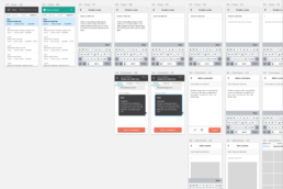
At this point in time, I was working in Sketch. Using the hand-drawn mockups as a loose user flow document, I put together screens that I could use for a couple of purposes.
First, I wanted to put these screens into InVision (since shuttered…design tools!) to show stakeholders and developers. Second, these screens would form the backbone of documentation for engineering.
Engineering documentation
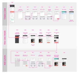
Flow charts doubled as part of a hand-off to the engineering team
As prototypes get more complex, they get less useful as a requirements artifact. Flow charts can be a helpful starting place for making sense of a proposed system.
Unified naming conventions helped during handoff
Practices like this help make small efficiencies across a design and engineering process.
High Fidelity Designs
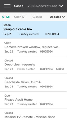
Sometimes well-executed basics can move the needle. This app gave clients a history of everything that was going on at their property, and it allowed them to easily ping support to kick off a case if something needed attention.
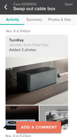
The main screen: familiar time-based messaging
Some key pieces of information to call out was who initiated the case (TurnKey or the owner), if there was an additional charge on the service, and the case number for reference in other systems.
Cases were organized by chronology
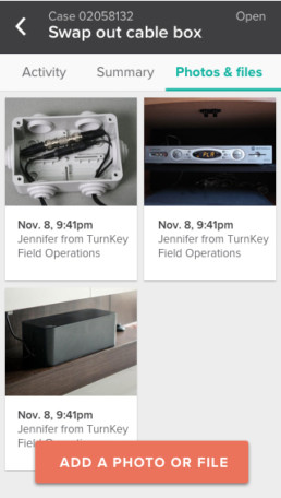
Tabs at the top of the messaging chronology allowed users to scroll past communications, or to see photos or files uploaded related to the case at hand.
Contextual changes
The main action affordance (in orange) would change on context. If I had to do the project over again, I would have used more accessible colors - the white against orange wasn't the best choice for readabililty.
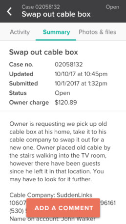
Clean summary with realistic data
I'm always of the geekiest things. As a summary / informational design, this felt clean and workable. I used anonymized data from Salesforce to give the mockups a feeling of realism.
Contextual wayfinding
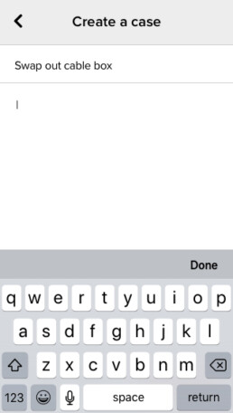
'Case: swap out cable box' helps keep the user anchored in the context of the overall case, and this small addition helped with user wayfinding as they were deep in a work flow.
Refinement continued with a 'Design QA' ceremony
This project kicked off a tradition at TurnKey. Rather than go back and forth in JIRA to resolve issues we saw in the product before launch, we decided it would be faster (and more fun) to all get in a room together, and to run quality assurance in person. Taco Donut Palace II was sure to be found at these events.
Impact
The founder of Indeed once said that at Indeed, "If it doesn't move the needle, we ripped it out. Even if it was neutral - it's not worth the tech debt." That quote stuck with me.
+39%
Improvement in resolution time for cases created on the project board
+9%
Increase in five-star ratings, for cases created on the project board
In this case, we had an unalloyed win on our hands. We took a 10% increase in 5-star reviews for tasks completed in the owner dashboard to be a measure of overall customer satisfaction. The next piece here would be to market this service to clients and get everyone on board. The bigger surprise was in case resolution time. In my opinion our clients and field operations staff were missing some crucial tools. We were able to deliver value, and they were able to resolve cases much, much faster.
Success
Efficiency gains
Cases created inside the 'owner dashboard' had a staggering 32% faster case resolution time due to an increased cadence of communications between clients and our field support team.
Success
Improved CSAT
We had a nearly 10% bump in 5-star cases created in the dashboard, validating our initial findings that clients valued the autonomy and visibility that the application created.
