Art direction and design for strategic re-brand positioned TurnKey for +$600MM acquisition
I worked with TurnKey's CEO, COO and other sr. stakeholders to lead a 12-month reimagining of the entire TurnKey brand. Working as both an art director and individual contributor, I was able to touch every part of TurnKey's visual brand – eventually leading to an acquisition by industry leader Vacasa.
CompanyTurnKey Vacation RentalsDuration12 monthsRoleLead design team (internal and contract), presented to board of directors, worked with content strategists. As an individual contributor: competitive research and analysis, managed design contractor, web design, brochure/print design, logo design, video
A Re-brand driven by business necessity
Stakeholders wanted to position TurnKey to serve the highly-profitable 'mass affluent' consumer market
In terms of scope and timeframe, the rebrand was the largest project I completed in my 3 years working at TurnKey, and one that I'm extremely proud of. The goal was to be the #1 tech-enabled property management solution out in the marketplace. We knew we couldn't beat industry darling Vacasa, with their great name and massive scale. We did think that we could own the market for affluent, value-seeking property owners and we set about to accomplish that.
The problem – TurnKey's previous brand didn't serve their goals
TurnKey wanted to be an acquisition target as the leading service provider of vacation rental management services to affluent rental owners
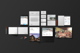
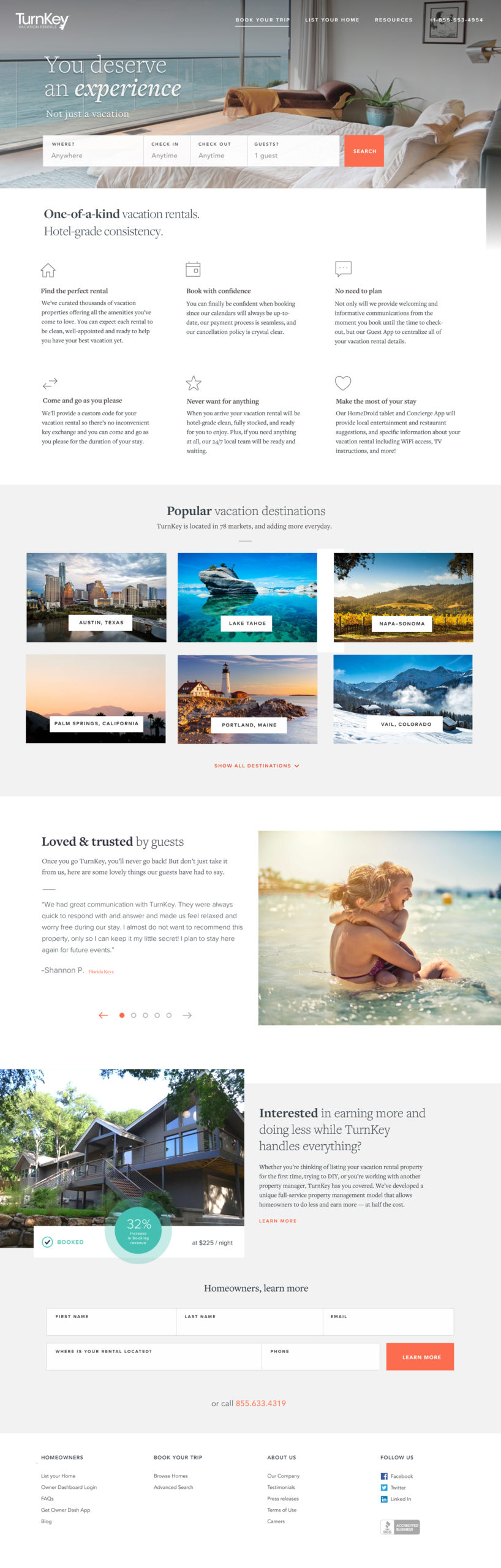
A peek at one aspect of the updated TurnKey brand

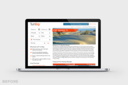
The ‘before’ design of the above website was broadly representative of the visual branding when I joined the company.
We started with the end in mind
I sat down with the CEO, COO and other sr. stakeholders at TurnKey to discuss goals for the re-branding effort
After extensive work on the brand style guide, a new logo, photography and a revised market segment, TurnKey was ready to become a leading acquisition target for the fast-growing travel industry
Goal
Rebrand all customer touchpoints
The re-branding effort needed to show up across customer touch points, including slide decks, excel docs and photography
Goal
Showcase tech-enabled property management
The branding had to express TurnKey's offering of property management backed up by techology
Goal
Resonate with the mass affluent owners of vacation rentals
The re-brand had to set TurnKey up for success, landing the company in the right segment of the marketplace

Letting Data Drive the Project
I studied survey data on value-ranked amenities for travelers in our target market
This data would help us as we got further into the redeisgn process. We wanted to target people familiar with vacation rentals, as well as people unfamiliar with vacation rentals who might be open to trying one out. If a particular experience or amenity was important to those guests, we could weave it into the brand narrative, especially the guest-facing website.
Factors that would make a non-renter consider a vacation rental. From Phocusrite’s 2016 study “A Market Transformed: Private Accommodations in the U.S.”
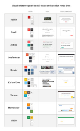
I led a wide-ranging competitive analysis
This answered the differentiation question - knowing the range of visual communication styles in the industry helped us know where we could find opportunities to stand out.
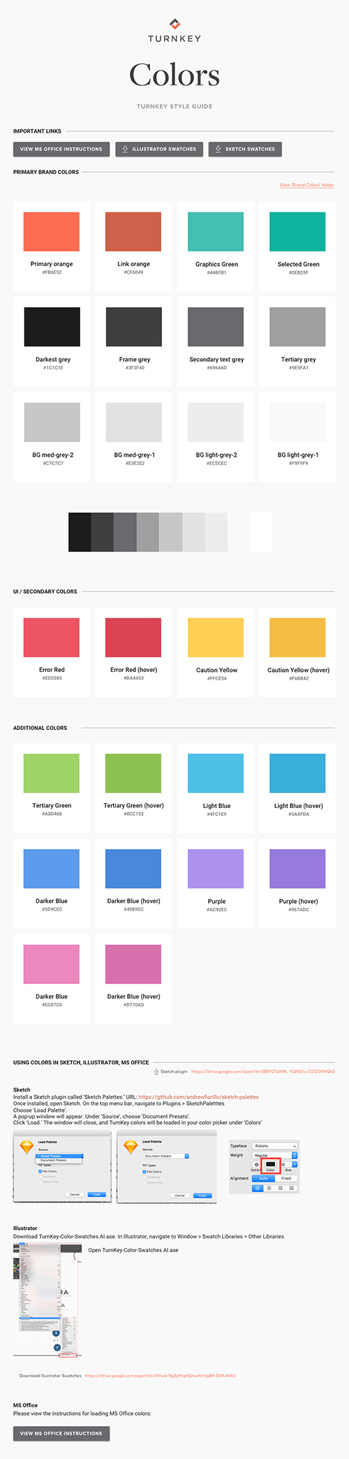
To help position ourselves via our brand palette, I conducted an analysis of color usage across the travel industry
Brand colors could help TurnKey differentiate from the competition and set ourselves apart within the travel and vacation rental management space.
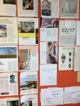
To diversify our sources of inspiration, I created an image board from upscale, travel-adjacent print media
The orange background was TurnKey's colors painted as accent walls around the office
Do research, go fast
Research allowed us to move with purpose
With our research complete, we started design. I art directed a design contractor for initial concepts. We found someone with a huge amount of talent to help us nail the look and feel of the brand. With a kernel of the new brand in place, I worked on fulfilling the promise of the initial concept, refinement, and solidifying a direction that we liked.
Initial concepts showed the pairing of a elevated visual aesthetic with a value-driven offering
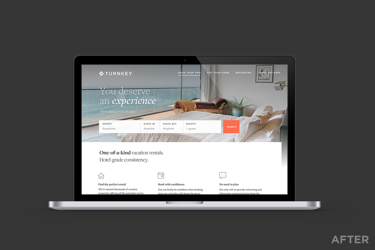
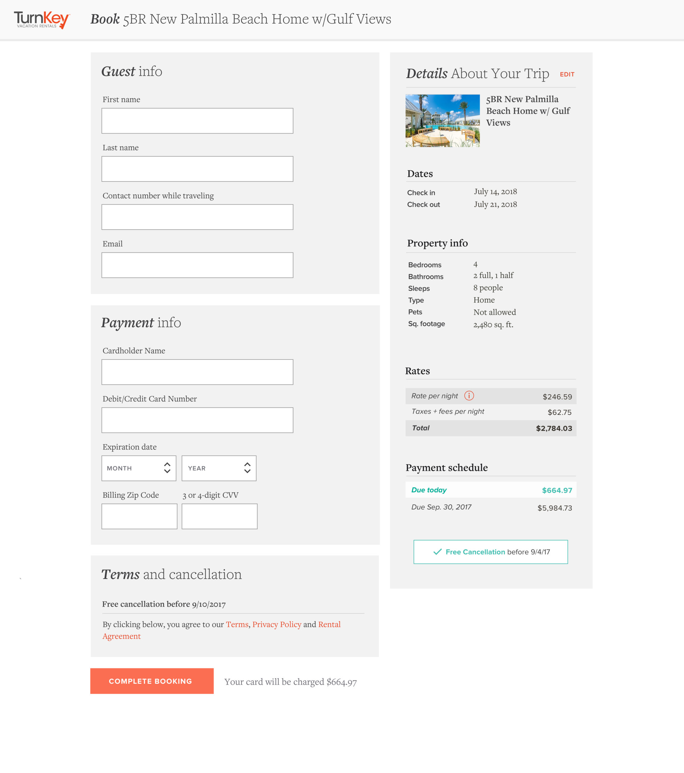
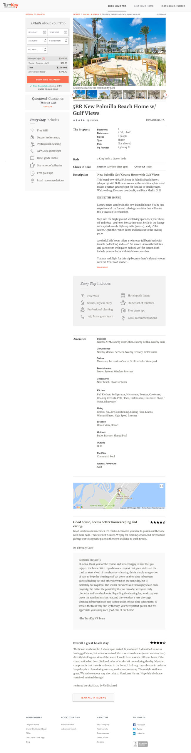
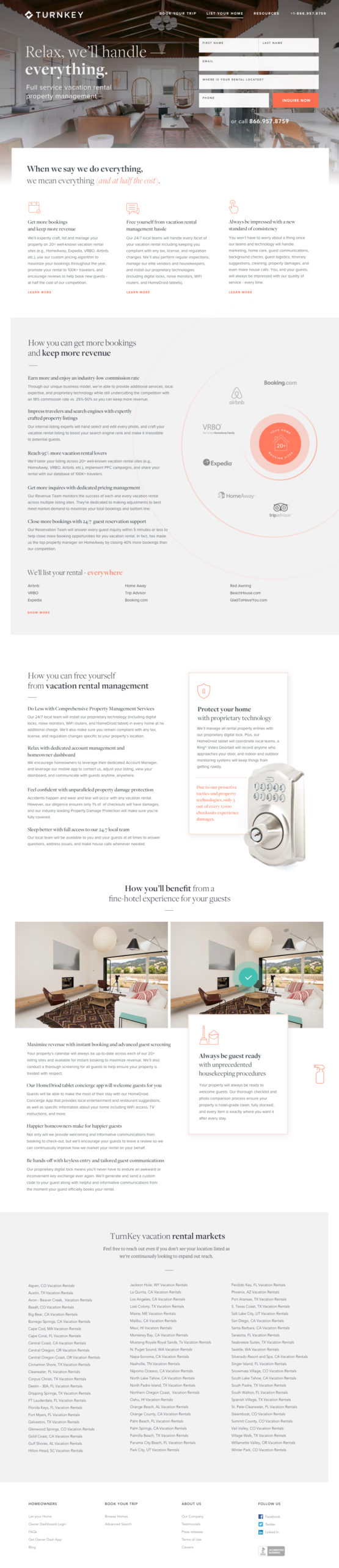
Starting with the home page, we found a style that would resonate with our target audience.
With the support of TurnKey's leadership, I translated concepts into designs for our digital products
With approval on a direction, we built out other pages on our website - the main interface for guests booking at Turnkeyvr.com
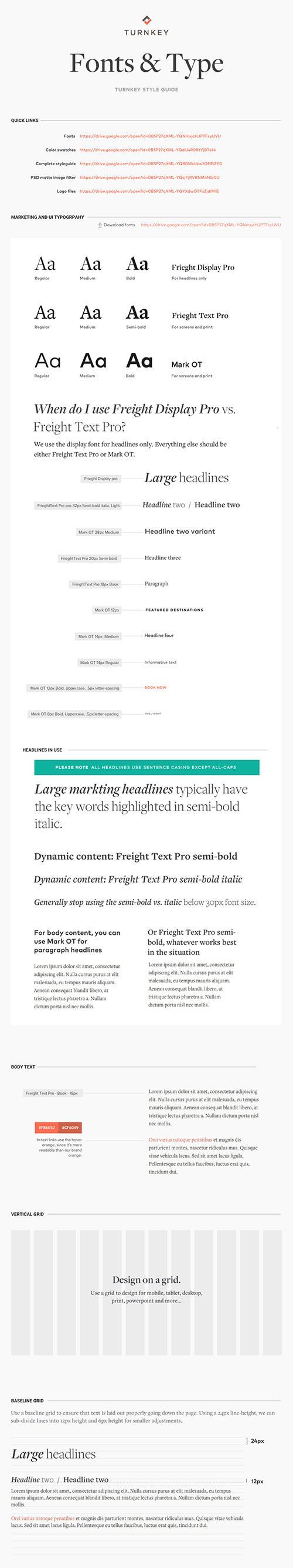
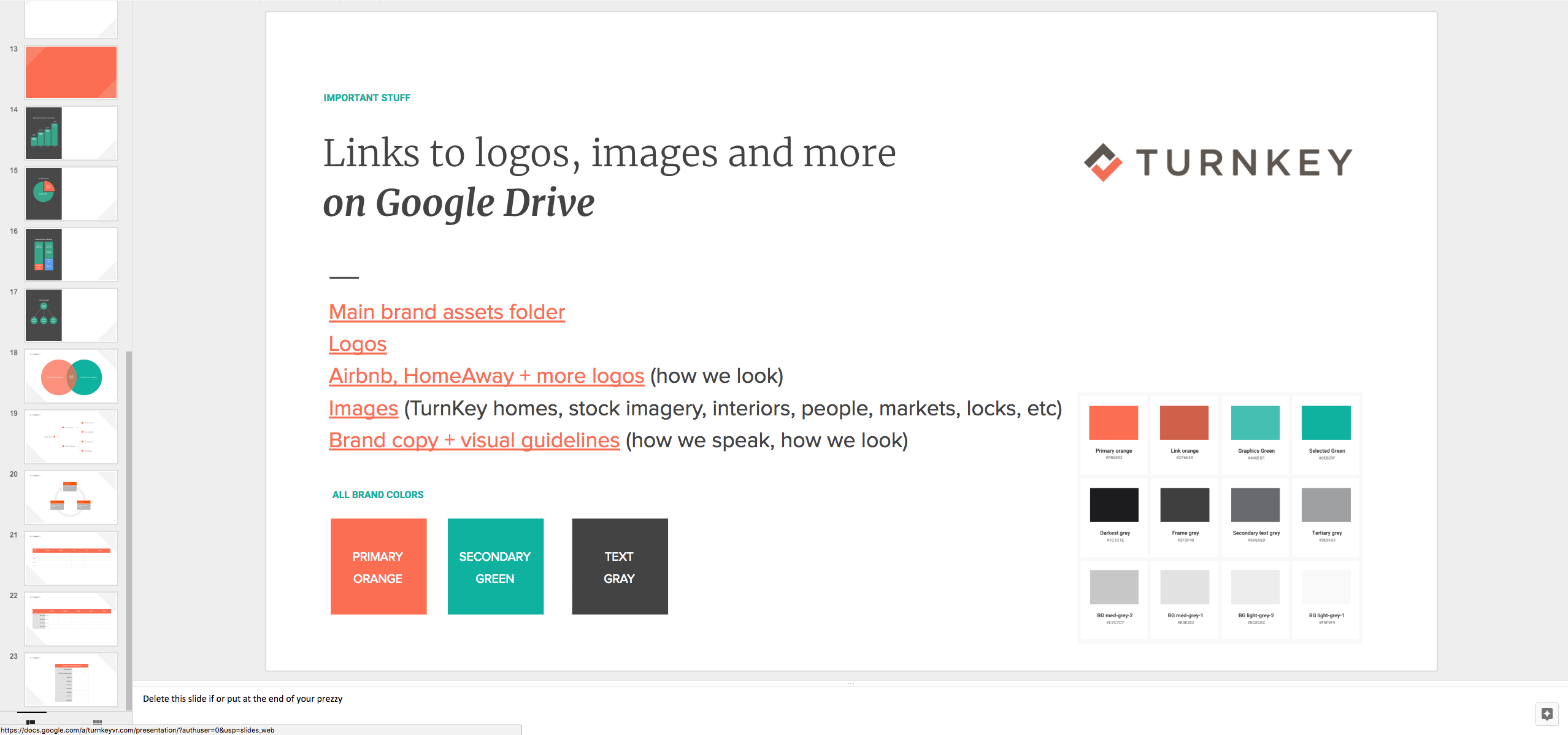
Style Guides Created Consistency
With a suite of design concepts, I created style guides to make sure that visual design could be executed with precision and consistency
It takes consistent work and strong execution to extend a visual redesign across an entire brand. Accountants, field operations specialists and data analysts appreciate having access to brand colors and typography inside of excel, google slides and more.
Brand guidelines
Knowing that there'd be lots of people working on the visual brand (designers, photographers, contractors and more) I created detailed brand guidelines. I created a library where people could go to download resources like fonts, logos, brand color libraries and Google slide decks.
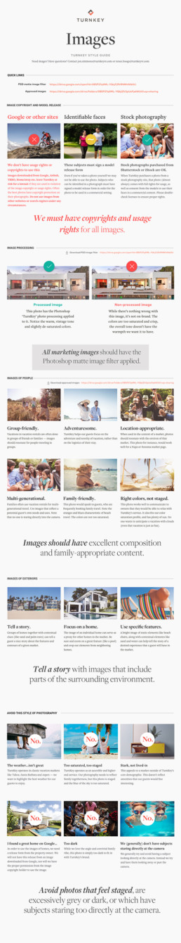
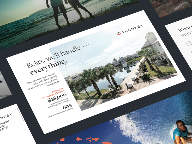
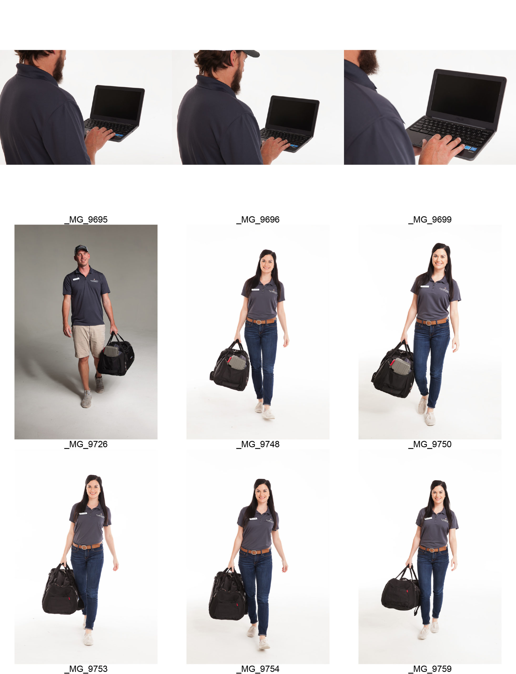
New Photography Elevated the Brand
I art-directed and managed updated photography, which was key in creating a unique and elevated service offering for owners of vacation rentals
Presentation was key to our value strategy. Even though we were aiming for a mass affluent audience, we knew that erring on the side of luxury in our presentation would increase the perception of value of TurnKey's service
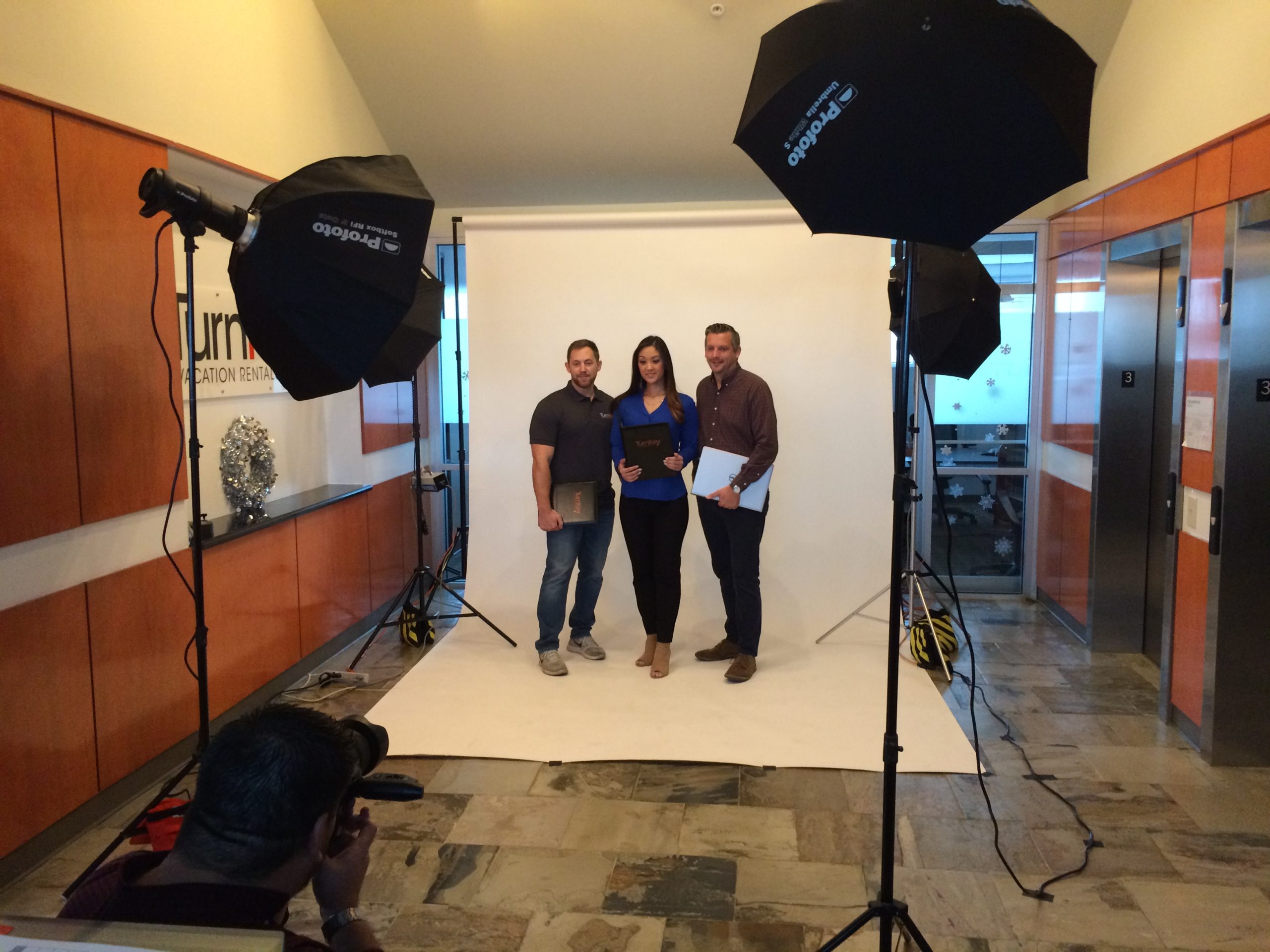
Along with re-branded uniforms, the photography illustrated TurnKey's elevated, high-touch service offering
Since photos were such a large part of our marketing, doubling down on unique, quality images created a huge lift for the overall re-branding effort
Bringing it together
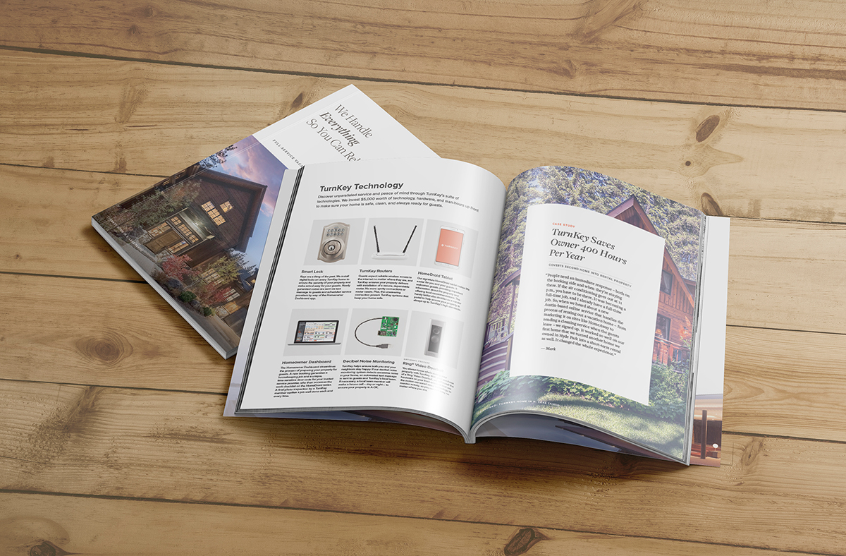
Together with content marketing, we created high-end magazine-style brochures to help attract owners to our service
In-house photography is expensive and time-consuming. So we used these bespoke images to the fullest advantage, creating new brochures, websites and handouts to show customers how our service was different.
Don't sleep on Excel, Sheets and Slides
I re-branded internal assets since customers often see slide decks, excel sheets and more
Branding isn't just about outward-facing materials. Steve Jobs famously argued for a high-polish design on the inside of a computer mouse. I didn't neglect internal teams - I created downloadable on-brand MS Office swatches for the data analytics and accounting teams
I designed an updated deck for sales and revenue management
Decks were often used to communicate revenue numbers to clients. We wanted to have every touchpoint be taken care of, so we designed assets for use by the sales and revenue management team.
My work helped Turnkey be acquired in 2021 for $600MM in cash and stock
In 2021, TurnKey was acquired by Vacasa for $619 million. I’m proud that this project made a profound and lasting contribution to TurnKey, and that through the hard work of the founders and 100s of employees was able to participate in a liquidity event.